NewAgeSysIT – Mission Page design
Project Concept
Visual Direction, UI/UX, Motion Design, Design System
Work

👋 Introduction
This page was designed as part of a broader brand experience for NewAgeSysIT, with the goal of translating the company’s mission into a visually engaging and meaningful narrative. I worked as the sole designer on this project, owning the entire design direction from concept to execution.
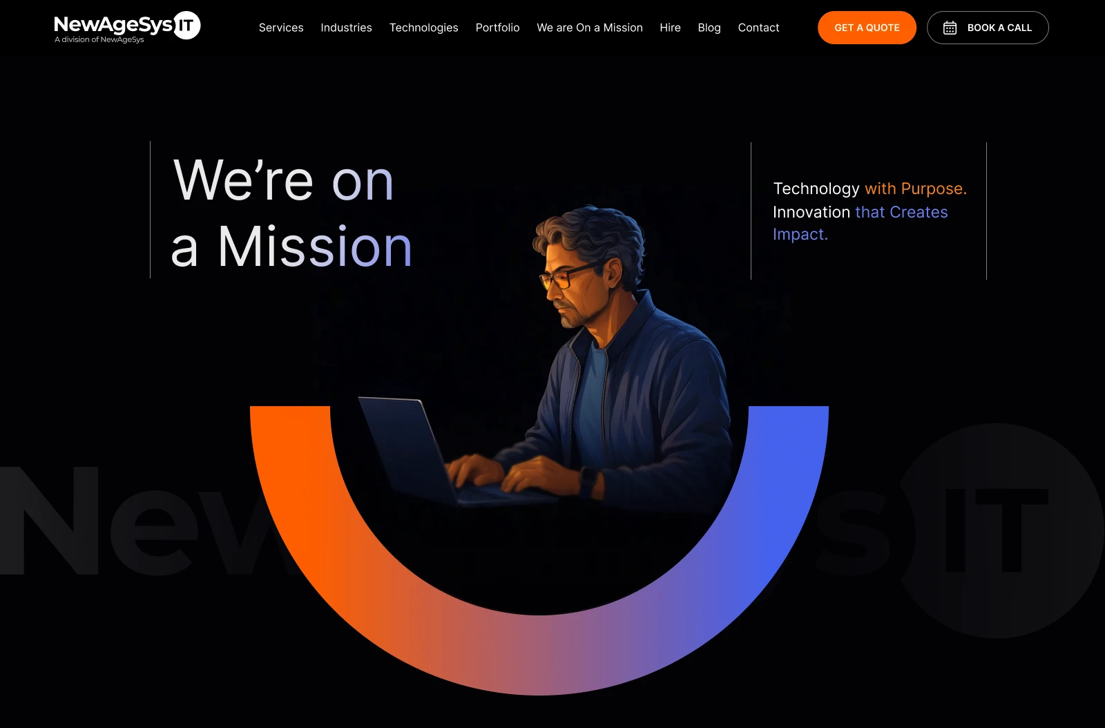
To break away from a predictable, text-heavy mission layout, I introduced a GIF in the hero section to immediately draw attention and create a sense of motion and intent. This helped set the tone for the page and made the experience feel more dynamic and modern.
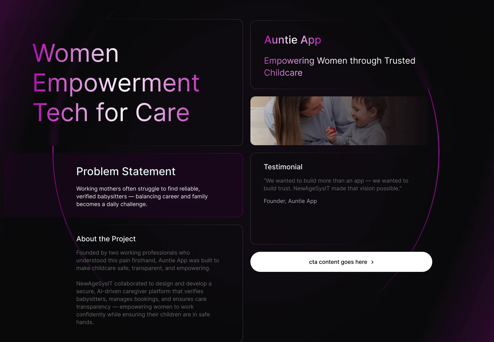
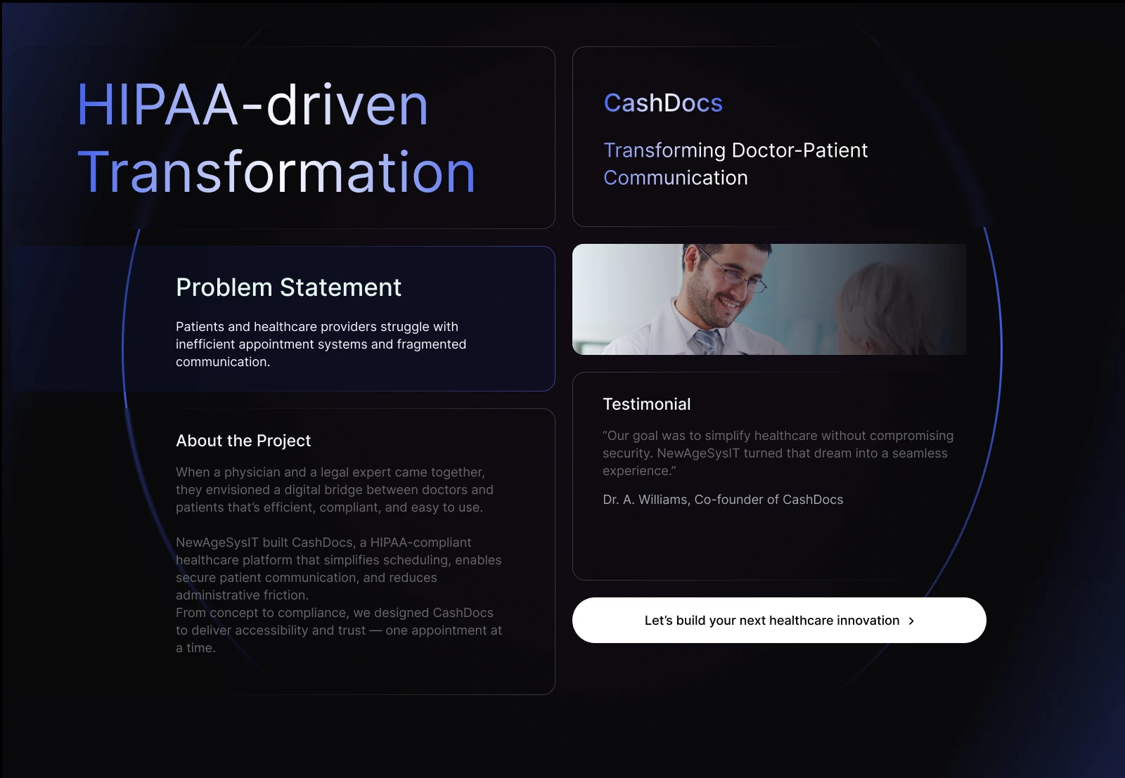
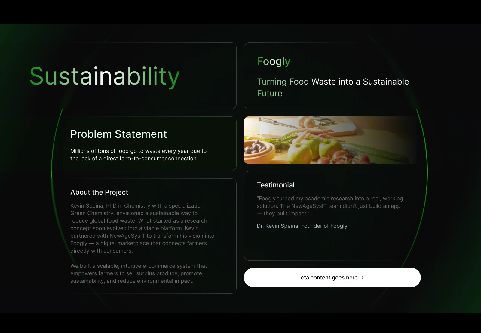
Different color accents were used throughout the page to visually represent NewAgeSysIT’s diverse projects and values. This approach not only added visual interest but also helped differentiate sections clearly, making the mission feel layered, purposeful, and easy to consume.
💼 My Role
I was the sole designer on this project and led the entire design process, including concept development, visual direction, UI design, and motion design.
Because this was a new page, I focused on defining a clear narrative structure that could support multiple mission-driven initiatives without feeling overwhelming. To achieve this, I introduced a color-based visual system, where each initiative is represented by a distinct color palette. This helped differentiate projects while maintaining consistency across the page.
For the hero section, I took a different approach by designing a motion-based visual instead of a static layout. The motion design was used to convey purpose, momentum, and innovation, setting the tone for the rest of the experience and making the Mission page feel more dynamic and impactful.
Hero Section
Cards
🤯 The problem
There was no existing Mission page, which meant the company’s purpose and impact were not clearly communicated on the website.
Multiple initiatives needed to be showcased, but without a defined structure, there was a risk of the page feeling cluttered or unfocused.
Presenting diverse projects under a single mission required a system that balanced differentiation with cohesion.
A static hero section would not have effectively conveyed the energy and vision behind the company’s mission.
💡Solution
Designed a Mission page from scratch with a clear narrative flow and strong visual hierarchy.
Introduced a color-driven system to visually distinguish different initiatives while keeping the overall design cohesive.
Created a motion-based hero section to immediately communicate vision, purpose, and forward momentum.
Built reusable layout patterns for problem statements, project context, and testimonials to maintain consistency across sections.
Ensured the design remains readable and structured despite handling a large volume of content.